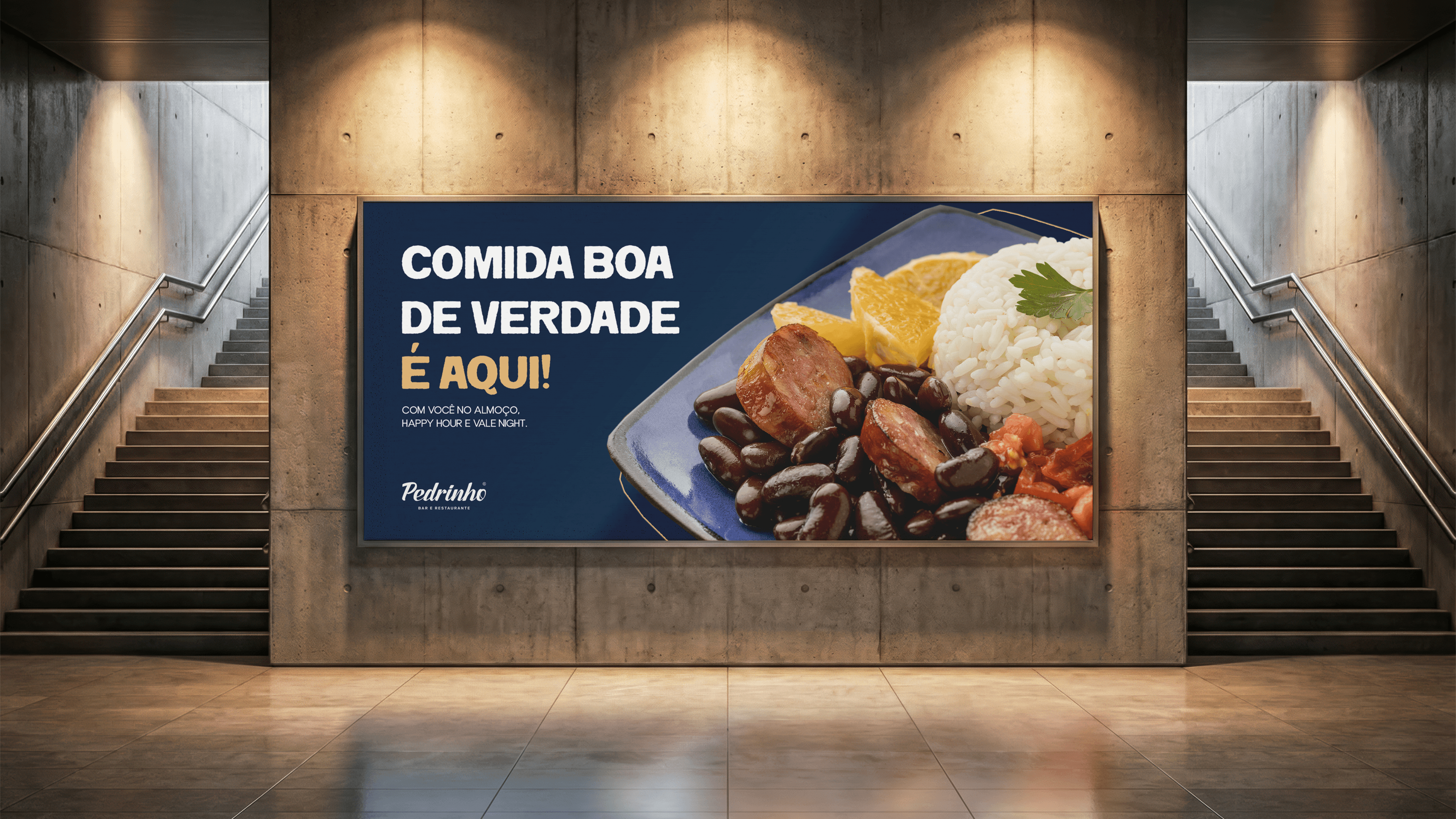
Pedrinho Bar and Restaurant was created with the idea of being a straightforward meeting place, without excessive formality, where the food and atmosphere speak louder than any speech. A place designed for everyday life, not just special occasions.
The aeneestudio’s work started from a clear diagnosis: it wasn’t enough to create a beautiful logo. It was necessary to build a brand that worked in the real world, with a strong presence on the facade, clarity in digital channels, and consistency at every customer touchpoint.

What we did
We developed a visual identity based on proximity and immediate recognition, using the name “Pedrinho” as the brand’s main asset. The typographic construction brought weight and easy readability, while the more sober palette positions the restaurant as a place to linger, associated with hearty food and a traditional bar experience.
The Essence
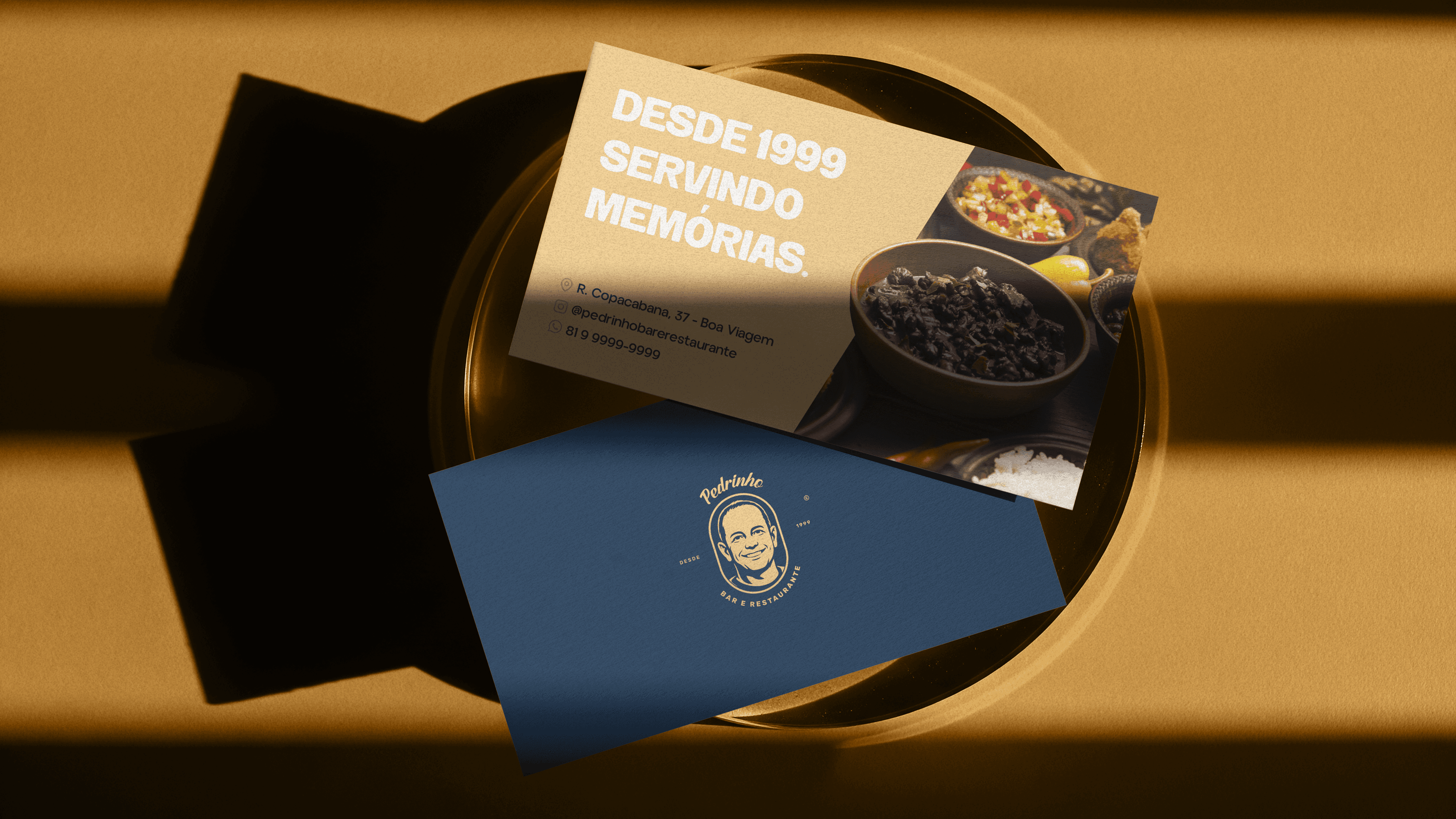
Beyond the identity, we structure practical applications for the day-to-day of the business: printed materials, guidance for social media, presence on Google, and strategic directions for capturing images and content. Everything is designed to ensure that the brand is not just about the visuals, but works consistently in operations.
The result is a brand with a solid foundation, prepared not only to launch, but to grow, establish itself in the neighborhood, and expand its presence with coherence.